Colour and Pattern are Making a Comeback. Here's How to Successfully Use Both

If you’re a colour lover then you’ve probably been feeling very lacklustre for the last decade as we embraced all things white and gray in the world of design. Well today I have good news for you. The trend has changed and colour and pattern are both making a comeback. The world of design is very cyclical and if you wait long enough it all comes back around again. I’m sharing exactly what you need to know to embrace colour and pattern as they make their grand re-entrance into our homes.
HOW TO BRING COLOUR INTO YOUR HOME
Create A Colour Palette

When creating a palette for your own home, you want to avoid the chopped up look that can happen when you use colour in one space but get scared and back off. If you don’t want to paint walls everywhere using a darker colour there are much simpler ways to bring colour into your space.
You can use it in furniture, artwork, rugs or even just a few decor pieces. It may not sound like it’ll be enough to create an impact but deeply saturated colours can make a strong statement, even in really small doses.
Regardless of how much colour you’re incorporating into your home, start by creating a palette of 2-3 colours.
Tips for Creating a Palette
When a client books a colour consultation with me I begin by sending them a questionnaire filled with colour schemes and the most popular room styles. Knowing whether your style is contemporary, rustic, traditional or modern helps you to navigate the world of colour. Not every colour translates into every design style so that’s a great foundation for understanding colour usage.
Next, I address fabric choices. Do you prefer solids or patterns? Solids can include fabric or leather and again, will be dictated in part by your design style. What about patterns? Your pattern preferences will be a huge factor in creating a colour palette so the more I know when I arrive, the better.
During the consultation I look for cues in your space as a jumping off point. For example, a beautiful rug or a favourite piece of art can be used to pull some or all the colours for your palette. Even if I only use a single colour from the inspiration, it starts the process and unfolds from there.
Create Continuity Between Rooms
Use one or more of those unifying colours and introduce it throughout your spaces. You don’t need to commit to painting walls in the same colour. In fact, often you can paint in various colours as long as you have something linking the rooms together.
For instance, you may paint the walls of your living room navy and the walls of your dining room in a deep, forest green. Bring a rug into your living room that has some of that green from the dining room. At the same time look for a beautiful piece of artwork for your dining room that embraces the same navy.
Be Consistent with Your Trim
Regardless of whether all your walls in your home are painted the same or different, I recommend using the same paint colour for your baseboards, millwork, doors and ceiling. This unifies the home and creates a nice flow from room to room.
The only exception to this rule is the ceiling. The goal is for your home to feel bright and airy and it’s easier to create this when the ceiling is painted just one shade lighter than the trim.
The ceiling is a flat surface staring down and it can appear darker than the same colour applied to trim and walls. I see this most noticeably when there's crown moulding. The same white on both the ceiling and moulding will look different and the ceiling will appear to be darker.
HOW TO BRING PATTERN INTO YOUR HOME
If you’re confident with pattern in your wardrobe then you’ll likely be able to handle pattern in your home as well. If pattern feels scary my best advice is just be sure to pay attention and plan this before you go shopping. Most mistakes with pattern occur because people are over excited and can’t resist the temptation to buy the pillows or artwork when they’re strolling around HomeSense.
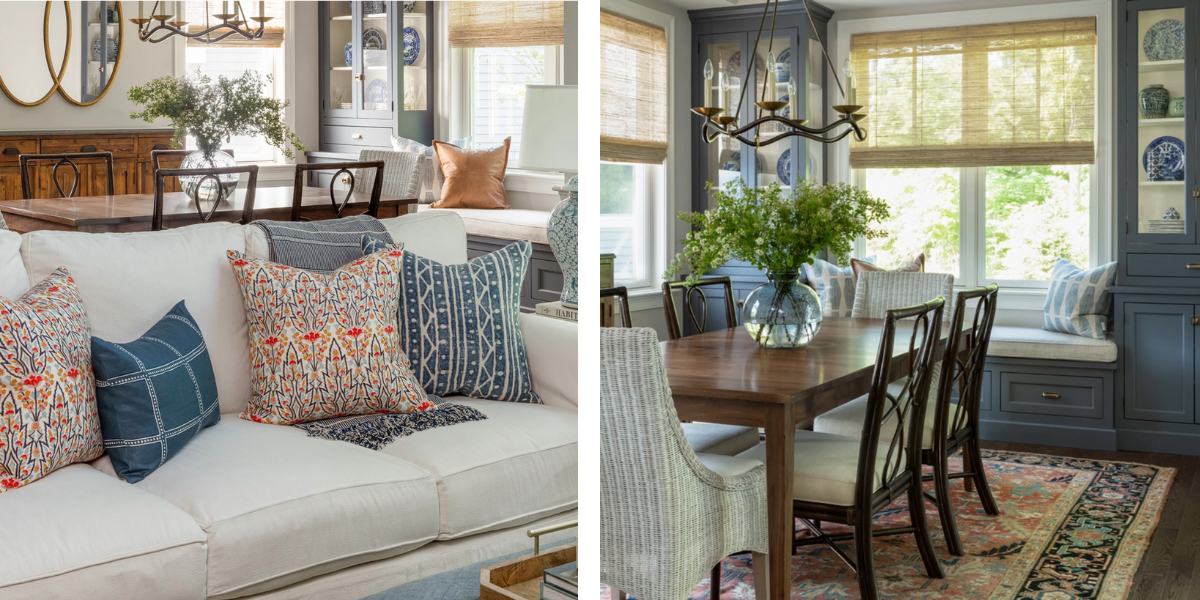
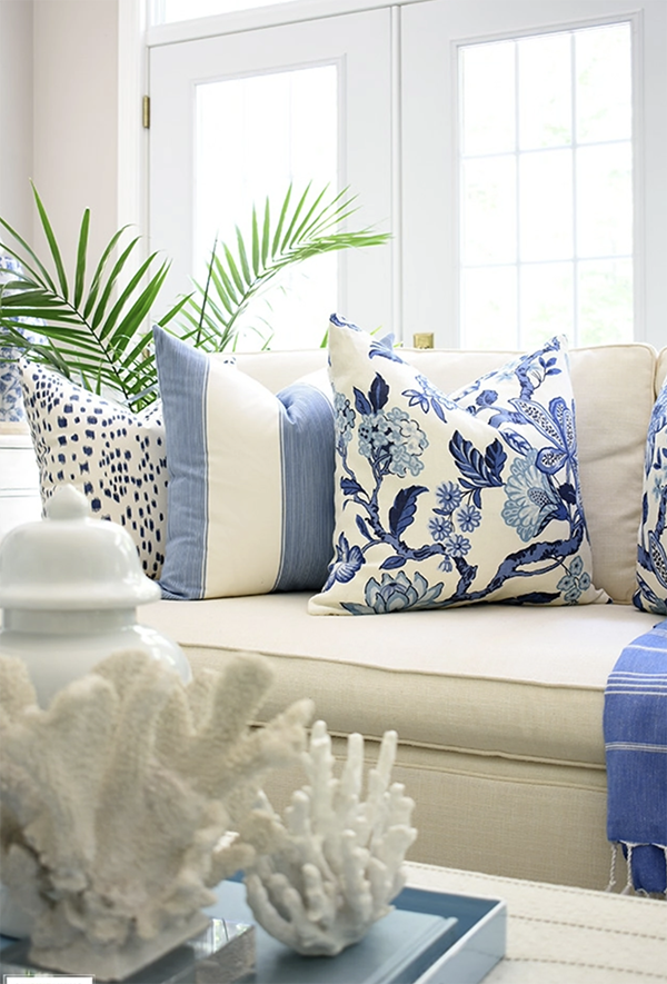
Same Colour, Different Pattern
If you love florals, stripes and checks you can have it all. The secret to getting this right is to unify the colour. They don’t have to be exactly the same but use the same hue and intensity and keep them within the same colour family.
If you were to introduce these three patterns in very different colours with nothing tying them together your eyes wouldn’t know where to land. It can create a chaotic and busy look if you don’t get this right.
Give Pattern Space to Breathe
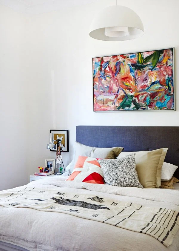
If you want to go all out with your use of pattern and you are determined to go big on colour just leave some breathing room for your patterns. For instance, if you want a headboard in a strong pattern with bold colour, consider adding the pillows in a solid colour. This will allow the headboard pattern to sing and be the star. After that, you can add in a patterned duvet as long as the patterns are complementary to each other.
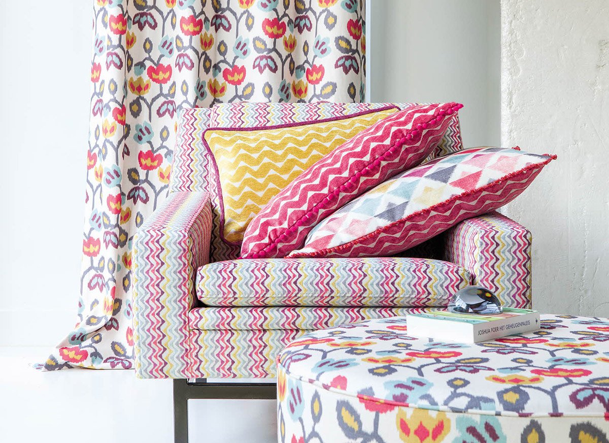
There Can Only Be One Showstopper
If you have a fabric that’s both heavily patterned and full of colour, that’s your star. You want to create a symbiotic relationship between the star and the supporting actors (the other fabrics). You can achieve this by using the colours from the main fabric and finding fabrics that enhance, not detract, from the main fabric.
No More than 3 Colours

While some designers are extremely talented at pattern mixing and can bring together a harmony of colours, most homeowners are not going to have success once they pass 3 colours. Stick with 2 or 3 colours and aim for some repetition so that they feel harmonious.
Pay Attention to Scale
The simplest way to approach multiple patterns is to consider the scale of the patterns. If you pick one large scale pattern like an oversized floral try mixing it with a medium geometric pattern and a small polka dot pattern. This way none of the patterns fight with each other from a sizing perspective. They all know their place and fall into line.
Also keep in mind the size and scale of the furniture you’re applying fabric to. A large sectional can carry a strong pattern whereas a tiny floral will be lost on the piece.
HOW TO BRING BOTH COLOUR & PATTERN TOGETHER IN YOUR HOME
This is where planning is essential. It’s not hard to mix strong colours with strong patterns but it’s never an accident when it works. If your room is a blank slate you can spend some time looking through Pinterest or flipping through design magazines to see what gets you excited. Here are some simple rules to keep you on track:
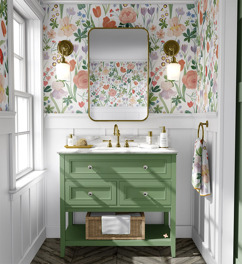
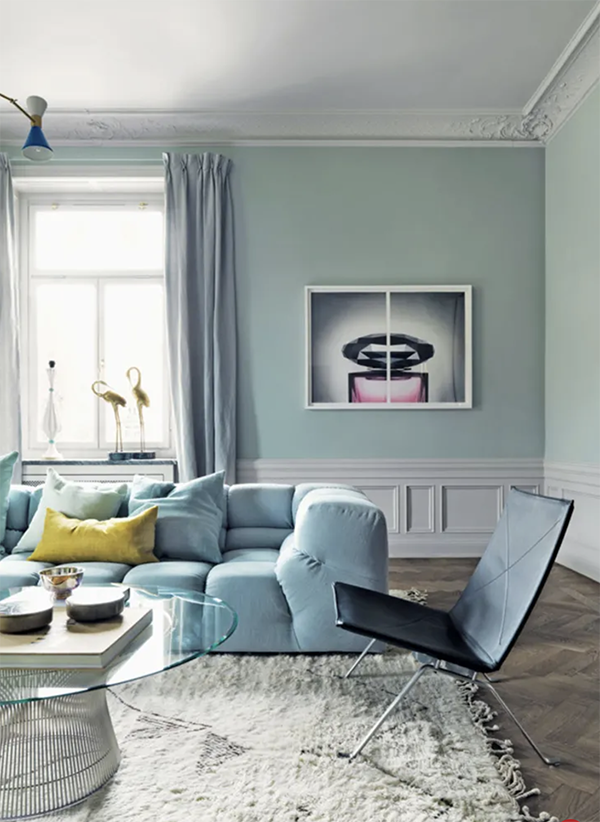
Be Consistent With Tones

If you have your heart set on painting all your living room walls in a deep cranberry colour you want to use another deeply saturated tone in the surrounding fabrics. Maybe you bring in a geometric patterned drapery that is Kelly Green and white. The strong green will help to balance the cranberry walls and make everything look intentional.
Mix the Colours, Not the Patterns
Make sure there is at least one consistent colour. This could be the background colour of your patterns so it might be white, cream, black or navy. Regardless, you’ll find it less jarring with multiple patterns and colours to keep something consistent and give the eyes a place to rest.
Try It and Edit Where Needed
Sometimes the rules work but they don’t feel right for you. Even if something technically works it’s not a winner if you don’t love it. Don’t be afraid to just pull something out and replace it. It sometimes takes a while before we perfect the use of both colour and pattern so have fun and enjoy the process.
Consider Reupholstering

The design industry still hasn’t recovered from the surge of activity that came with the pandemic. Timelines for new upholstery is generally between 6 months and a year but can be delayed up to 18 months.
This has forced a lot of us designers to start embracing reupholstering over new purchases. If the frame and the foam (or down) in your current piece is solid, consider this a less expensive and much faster alternative to new furniture.
In a recent Design Work session my clients fell in love with a fabric from Maxwell Fabrics and decided to reupholster their sofa instead of ordering new. The benefits of doing this were they could update the sofa with new fabric and give their space a brand new look. We already know the scale of the sofa is perfect for the space. The fabric they picked is much higher quality than the standard fabric options at a retail level and in just 8 weeks they’ll have a “brand new” piece of furniture for a fraction of the cost of new.
Sometimes we have to think creatively about an obstacle and the solution is even better than the original option. Don’t be afraid to explore this option. I have a library of fabric books that we can consider and you’ll truly end up with a one-of-a-kind piece in your home.
I hope you’re feeling a bit more comfortable to take some pattern risks in your home. You can always start small and over time I’m sure you’ll learn to be more confident in your use of both colour and pattern.
Warm regards,
Adrienne