Why is White so Difficult? It's All About the Undertones

If you’re new to the world of paint you might be wondering why anyone would spend so much time discussing the colour white. Surely that’s the easiest colour of all, right? Well buckle up because it’s a ride to really understand whites. They’re the most difficult because there are so few whites that are pure. White paint undertones will make your head spin.
Why does it matter what the undertones are?
I know what happens. You go to the paint store filled with excitement. You’re ready to pick the perfect white for your home. You stand in front of the wall of paint chips and your enthusiasm starts to wane. Why are there so many to choose from? Eventually you pick one, certain you found the magical needle in the haystack. The one that will make your home shine. Off you go, excited to get this project going.
With paintbrush and roller in hand you jump right in. As the paint starts to cover you stand back in shock. The perfectly white-white from the paint store has transformed into something less white. It has a tinge of colour that you definitely didn’t pick. It has to be a mistake so you rush back to the paint store.
After a lengthy discussion with white paint chips scattered everywhere you learn the secret. It’s the undertone.
What Is an Undertone?
In technical language it’s a faint or subdued tone hidden within a colour. In the simplest language possible it’s a colour hidden within a colour. When you look at the white in isolation you don’t see it. It only becomes apparent when it’s living beside other colours.
You may have never needed to understand this before but undertones are hiding everywhere in your home - in the paint, fabrics, tile and yes, even in your wood and stone. Once you understand how to pick out the undertone your life will be transformed. Well, at least your paint selections will become easier. Instead of poring over hundreds of white options you’ll be able to narrow your choice down to the few that will be perfect in your room.
Let's Look at Benjamin Moore’s Whites
Let’s do a deep dive into Benjamin Moore’s world and let me help you learn how to make the best choice. Never again will you have to spend more time or money than absolutely necessary to get the white paint undertone you want.
Every colour in the colour wheel can be an undertone - pink, green, blue, yellow, peach, purple and on and on. Knowing this is useless when you’re struggling to find a white for cabinetry, doors, trims or your ceiling.
Warm Versus Cool
An easier way to pick the perfect white is to decide whether you want a warm or a cool white. Most of us, even if we have no design instincts, can look at a white and see whether it looks creamy and warm or a bit blue and leaning towards cool.

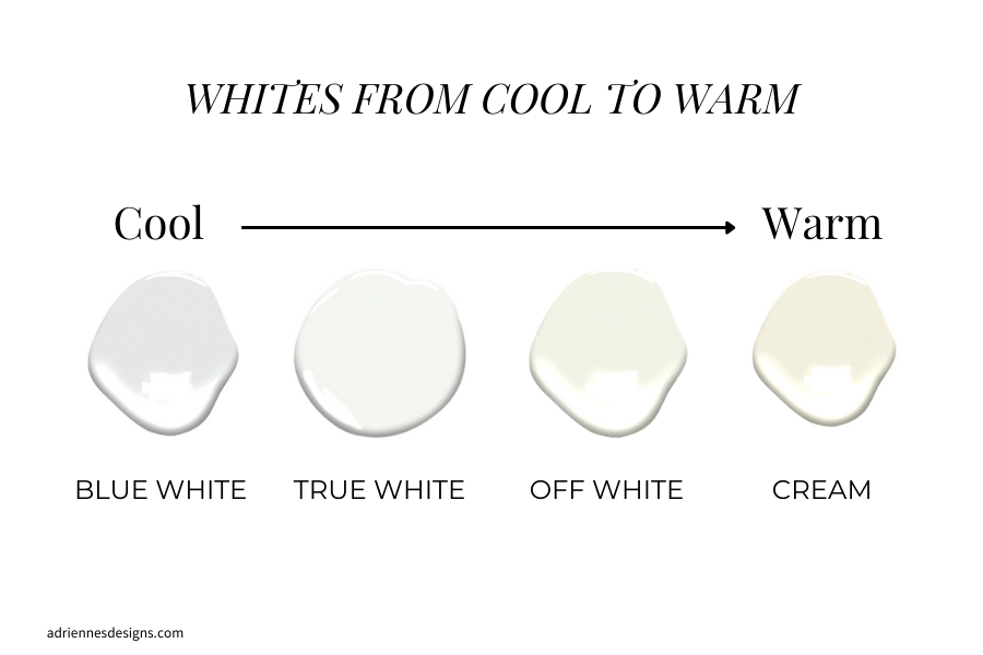
As you can see from the image above, whites range from blue white to cream. If you were to hold up any of these paint chips alone you’d say it’s white. You can see here when they’re lined up like this that there’s a world of difference between them. I think even if I had mixed these up most of you would be able to identify the coolest and the warmest.
There are four main categories of white - blue white, true white, off white and cream. You can see how the undertones will change the colour entirely. And when you paint your entire room, those white paint undertones will be screaming at you. No more subtlety!
Here are some of Benjamin Moore’s best whites for each category:
BLUE WHITE - White Diamond 2121-60 & Pure White OC-64
TRUE WHITE - the gem that’s the closest to colourant free - Chantilly Lace OC-65
OFF WHITE - Cloud White OC-130, Simply White OC-118 & White Dove OC-17
CREAM - Ivory White CC-130 & Mascarpone AF-20
Which White is Best For You?
My job as a designer is always to help you understand your own preferences, even if you’re not sure. Most of the time you know but can’t articulate it or haven’t ever really put a lot of thought into it.
I start by building a foundation palette. I want to know if you prefer a fresh palette that includes crisp whites along with pops of bright colour. Or maybe you tend towards an earthier palette with creamy whites and muted colours. If you’re not sure, often I can find it in what you already own as well as the clothes you wear.
What’s a Fresh Palette?
If you built or renovated in the last 15 years, chances are you have a fresh palette. It doesn’t matter whether you picked the finishes, the builder picked them or even a previous homeowner. If you have black and gray countertops, tiles and carpeting you likely have a fresh palette.
If that’s your palette you should consider whites that range from blue white to off white. These whites are going to shine next to cleaner colours.


What’s an Earthy Palette?
What if your home was built in the 90’s or early 2000’s? The chances are you’re living with an earthy palette. Take a look around at your carpet, tiles, paint and fabric. What do you see? A lot of beige and brown? If you’re nodding your head then you have an earthy palette. In your case you should lean more towards the creamy range of the white undertones. These warmer colours pair beautifully with beige, brown and other muted colours.


Once the foundation palette has been identified, it's easy to stay on track and determine which whites will work best in your home.
*PRO TIP* If you’re renovating your home but it’s just a single space that needs updating, have a look around. What do you see around you in the adjoining spaces? Start with the fixed materials like tiles, countertops and carpeting and then move outward to the furnishings and decor. Do you see more beige and brown or are most of your finishes black and gray?
This will ensure that you stay true to the pre-existing style of your home. What you really want to avoid is adding today’s colour palette to yesterday’s home. It’s easier to work with what you have and modernize it than to fight with it and create a look that’s disjointed.
How to Find the Undertone in Your White
If you’ve been frustrated with whites, get ready for this tip because it will change your life. Use a control white to identify all the undertones of every other white.
What that means is you’ll pick one of the true whites that have no obvious undertone. My favourites are Benjamin Moore Chantilly Lace OC-65 and Sherwin Williams Extra White 7006. Place the control white on top of any other white and immediately you’ll see the undertones. You can use this trick for fixed materials like countertops, tile or cabinetry or you can do it in the paint store to pick the best white paint.
This will immediately show you whether the colour you’re looking at is a cool (blue) or warm (yellow) white. You’ll also be able to see the pesky colour that’s hiding inside. If you don’t like warm whites as soon as you hold your control white up to a colour like our beloved Cloud White you’ll know it’s not for you.
When You Should Use a Control White
If you’re renovating a space but you have a few pieces that are salvageable you’ll want to use this trick. For instance, a bathroom that’s leaving behind a white vanity needs a control white test. You can be sure you’re buying the right tiles, paint etc to complement the vanity rather than creating chaos.
If the vanity leans towards blue white or off white use a fresh colour palette. Your materials you’re buying should be gray, black or more cool whites. Conversely, a creamy white vanity will look its best if you add earthy browns and beiges in the accompanying materials.
What to Consider When Painting White Walls
Light in your room is the most critical factor if you’re considering painting your walls white. If you have few or no windows white will never look its best. You need at least two large windows and if possible, they should be opposite from each other. This will create that dreamy, luminous glow we see in magazines.
Your white paint should be the very last selection made. You want to focus on the expensive, fixed materials first. Once you’re happy with those you can find the white that best enhances your other selections.
White isn’t a solitary colour. You can’t slap white paint on the walls and expect it to create the effect of a pulled-together, finished space. I always create a small, medium, large focus to make white look its best. The walls will be the large item and your medium item should be a significant piece of furniture so maybe a sofa or a chair. Lastly, you can toss in a few decor items like a lamp or a pillow.
It probably goes without saying but it’s worth repeating. Pick your white paint to reflect the fixed finishes.
Walls Versus Ceilings
It’s a beautiful look to paint your walls white and wrap it across the ceiling. Accomplishing the look isn’t as straightforward as you might think.
Plot twist, never paint the walls and ceiling with the same white paint. The ceiling will always look darker than the walls because it’s a horizontal surface. Light reflects differently than it does on vertical surfaces.
Instead, pick a category of white that’s just slightly lighter than the wall colour. For instance, if you chose a creamy white for the walls, pick an off white for the ceiling. And if your walls are off white, go for a true white on the ceiling.
White for Your Trims
The white for your trims will be dictated by the undertone of the white in your fixed finishes as well as your kitchen cabinets and decor.
If you have white cabinets, use the same white for your trims. This works because often we have a window flanked by upper cabinets but if the trims are not the same white as the cabinetry, it won’t look great. You’ll end up with competing whites and creating an imbalance.
Making Different Undertones Work Together

If you’ve ever tried to mix cream and white together you’ll know just how difficult this is. In a recent project, my clients had selected cream as part of the overall palette. We chose Benjamin Moore Mascarpone for the cabinetry and they were smitten.
The wrinkle in the plan occurred when they also fell in love with Calcite White Quartzite for their countertop material. The creamy white cabinetry and millwork were being installed throughout the entire home. The only possible way to make these 2 opposing whites work was through repetition.
I intentionally repeated the blue-white colour of the countertops in the 12x24 floor tile. I also added a penny tile in marble as a border.Next, we used Mascarpone on the walls to create a cohesive tie to the cabinetry. Lastly, we added tongue and groove woodwork on the vanity wall to add texture but repeated the paint colour here as well.
The consistent use of both colours made it look intentional. Without that, it would have looked like a mistake.

Final Point
Be sure to test your white before committing to buying a whole can and painting your walls or trim. The best way to do this is by painting a large sample board, instead of your wall.
Buy a tester pot of paint from your paint store. You can go to the dollar store and pick up a large artist's canvas. The advantage to using an artist canvas or bristol board is that once painted, you can move it around the room. Compare it to your fixed finishes and furnishings and take it with you when you are sourcing finishes or decor. The bigger sample will also make the undertones more visible.
I hope you feel equipped to tackle the world of whites now!
If you feel overwhelmed with choices for your kitchen renovation you’ll love my Kitchen Finishes Service. I’ll help you select your materials so you never make an expensive mistake. If you just need help picking paint colours, I can help with that too!
Warmly,
Adrienne