Why is Beige so Difficult? It's All About the Undertones

By now you may have heard that our beloved gray has been pushed aside in favour of cream, sand, beige and brown. Colour preferences are like any other trend and go through a cycle of approximately 10 years before they lose momentum and fall out of the spotlight.
Neutrals are the most difficult and while I recently shared everything you need to know about white, now it’s time to talk about beige. You may think that beige is beige and that you can deal with it on your own but once you step into the paint store you quickly learn how different (and difficult) beige can be.
Just like with white, beige has a series of undertones that will affect the way it shows up on your walls. If you have a creamy or sandy floor tile for instance, you need to know the undertone of that before you pick another beige for the wall. Yes, you can have clashing between beige. Most often you won’t consider it clashing but your eye will detect that something’s not quite right.
WHAT IS AN UNDERTONE?
It is a faint or subdued colour seen through another colour. There are undertones in every fixed element of your home. Whether it’s paint, fabrics, tile, wood or stone, and knowing which white undertone is present in your existing fixed white finishes will take the world of hundreds of whites and narrow it down to just a few that will be suitable for your project.
Beige and Its Undertones
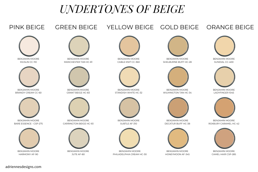
Would you be surprised if I told you that beige has 5 undertones? Most of my clients are shocked to learn that beige is so diverse. So with all those undertones it’s important to be able to identify which of those will work for you in your own space.

Photo description here
When you see this series of beige paint swatches it becomes more apparent that there are undertones to each of them. It’s actually quite easy to identify them when you see them all side by side like this.
Pink Beige - BENJAMIN MOORE DUSTY ROAD CC-310
Green Beige - BENJAMIN MOORE BLEEKER BEIGE HC-80
Yellow Beige - BENJAMIN MOORE STANDISH WHITE HC-32
Gold Beige - BENJAMIN MOORE DECATUR BUFF HC-38
Orange Beige - BENJAMIN MOORE PAPAYA CC-248
What Do All Beiges Have in Common?
All beige paint generally falls within the earthy category. Unlike whites which go from warm to cool, beige just relies on the undertone to differentiate one beige from another. The options within beige can range from very dark and moody to quite light. Currently we are opting for a lighter version than what we loved in the early 2000’s. This tends to give an updated and fresher feel to your space because of their lightness.
Oftentimes I refer to these lighter beiges as complex creams because they are the palest of the beiges but still have one of the 5 undertones.
Which Beige is Best For You?

So you’re ready to embrace beige but which undertone is right for you? Start by identifying the largest fixed element in your room. Fixed elements could be considered the sofa colour in a living room, the counters in a kitchen or floor tile in a bathroom.
I typically start with identifying the dominant fixed element in the room. After that I work on identifying the undertones. When you’ve figured out the undertone it’s easy to find a complementary beige paint with a similar undertone.
For example, in the photo below there is a pink beige travertine tile on the floor and a pink beige colour has been used on the wall to coordinate to the floor tile. The match is perfect and the end result is a peaceful harmony between the paint and the tile.

Selecting the Right Undertone
So now you understand the basics of beige and its undertones. How do we go about detecting the undertone in our homes? The easiest way is to compare the colours side by side.
Years ago I worked at Benjamin Moore doing colour consultations on Saturdays. I would watch as customers would come in looking for a beige wall colour. They would stand at the wall and pull the samples off one by one but never compare the samples side by side.
I would ask the client what type of beige they were looking for. Some customers were confused because they didn’t realize that there are many different undertones, whereas other people would say, “I don’t want something that is going to turn pink when I put it on the wall”.
Paint never turns a colour. The simple fact is that the undertone may not be obvious and you need to compare it to another colour in order for the undertone to reveal itself. I would take samples off the wall and line them up and it was then that customers could see the different undertones stand out. Most clients could quickly eliminate the ones they didn’t like and choose the right fit for them.
How to Pick the Right Beige
If you’re dealing with fixed finishes in a beige tone and have determined that they won’t be changing, you might be overwhelmed with the idea of picking another beige to complement those finishes. It's important to have a sample of your fixed finish that’s in the space. It could be fabric from a sofa, tile from your bathroom floor or a sample of the counters you have used in your kitchen.
One of the five undertones will be present in the sample you have so start by asking yourself this simple question - does this sample have a pink, green, yellow, gold or orange undertone to it?
Grab some beige paint samples and lay them, one by one, on top of your fixed finish material. If the colours look similar with the exception of being lighter or darker, you likely have the right undertone. If you’ve picked the wrong one an undertone will appear as a different colour.
The three photos below have a beige wall colour. The first image on the left is green beige (BM Abington Putty HC-99). In the centre is a pink beige (BM Cedar KeyOC-16). The third beige on the right is yellow beige (BM Monroe Bisque HC-26).
It's easy to tell that when we compare them side by side that the pink beige in the centre is the best choice because it relates to the fabric of the sofa.

Things to Keep in Mind When Painting Your Walls Beige
Now that you’ve got an understanding of the importance of undertones, let me share what you need for pairing other colours with beige.
Muted or muddy colours work best with beige. You can see from the images below that while both blues are pretty colours on their own the muted blue works better. The muted blue tones in the image on the left enhance the neutral tones of the window seat upholstery and the shade of the floor lamp.

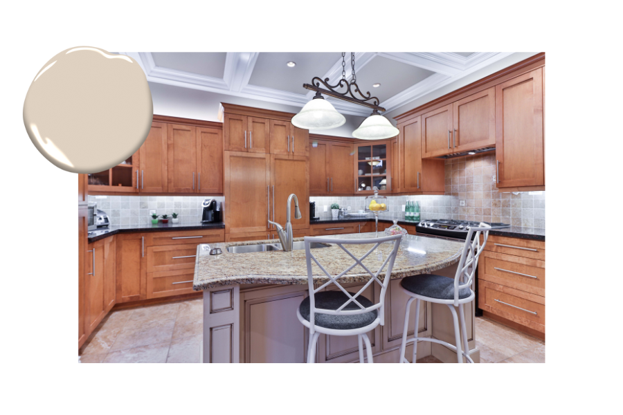
Which Undertones Don’t Work Well Together?
The two undertones that don’t work well together are pink-beige and yellow-beige. In the photo below we have a yellow beige counter on the kitchen island and pink beige tile flooring and backsplash.
Typically the pink beige will appear dirty in comparison to the yellow of the kitchen island. The homeowner in this case would have been better to use the dark countertop material from the perimeter and carry it to the island. I would have also chosen a light beige with a pink undertone for the wall above the cabinetry.
Finding the Right White for Your Beige
As I mentioned in my previous post about white and its undertones, I typically pair off-white and creams with bieges because they create a softer look. The true whites and blue-whites are a bit too crisp for beige.

I hope you’re feeling confident in your new knowledge and that you can head into our new beige trend knowing that you have the tools to pick the right colour.
If you’re still really unsure and afraid of wasting time and money, I’m happy to help you pick your colours. My colour consultation can be done in your home or via zoom. If you’re interested, you can learn more about it here.
Warm regards,
Adrienne